Update the packaging for the full PINK Beauty line.
The brief started as a packaging redesign across every SKU.
A relaunch of PINK Beauty's identity and packaging across the full line, from consumer research to the shelf and the brand's first EDP.
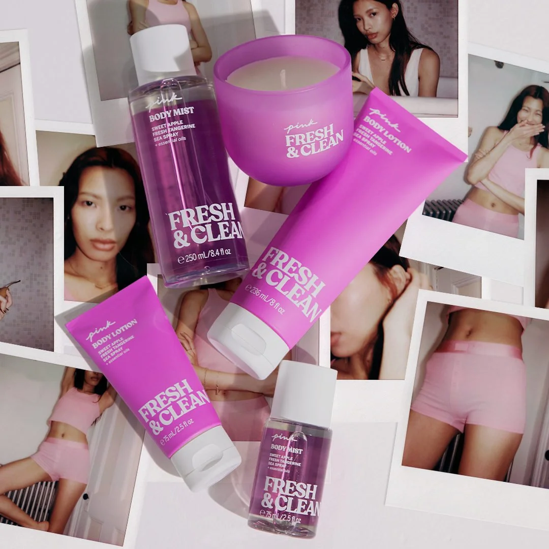
Update the packaging for the full PINK Beauty line.
The brief started as a packaging redesign across every SKU.
Make the packaging carry the strategy.
I translated consumer surveys, trend insight and competitive research into a refreshed visual identity, so the redesign answered what customers were telling us rather than only updating the look.
Beauty customers wanted products pretty enough to keep on the shelf.
Customers were craving more aesthetic products to display, not hide. We did a deep dive into what was trending in the market and how to reskin the packaging around what customers wanted to see.
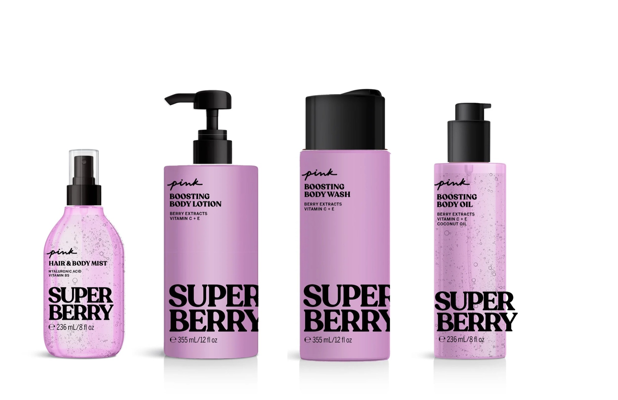
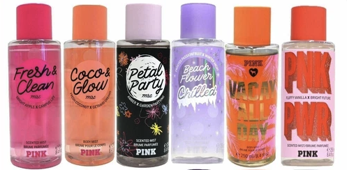
A refreshed identity for the full line.
A defined design direction, typography, color palettes and hierarchy for each SKU, extended to the brand's first eau de parfum, PINK by PINK.
I collaborated with product development, marketing, creative and merchandising to define the direction, then worked closely with the designers through production to make sure the packaging reflected the brand strategy and consumer preferences, from concept to final in-store execution.
Creative direction, strategy and new business. Tell me what you're working on, or ask for my résumé.